Tableau Dashboard Design Portfolio
this is a culmination of work over years of ux/ui design for a data analytics firm. scroll through as fast or as slow as you’d like, there is a lot, but don’t be afraid to zoom in and take in some details.
**all dashboards were produced in tableau a data analytics software. all names, data, data types, and colors have been reworked as all client work is under nda.
-
stage 1: user interviews
objective: understand the needs, preferences, and pain points of the end-users.
activities: conduct interviews and surveys with key stakeholders and potential users to gather insights on their requirements, goals, and expectations.
outcome: a comprehensive understanding of user needs and a list of features and functionalities to prioritize.
stage 2: data group aggregation
objective: identify and consolidate relevant data sources.
activities: collaborate with data teams to gather, clean, and aggregate data from various sources, ensuring accuracy and completeness.
outcome: a well-defined data structure and a dataset ready for visualization.
stage 3: wireframing
objective: create a preliminary visual layout of the dashboard.
activities: develop low-fidelity wireframes to outline the placement of key elements, such as charts, tables, filters, and navigation.
outcome: wireframes that provide a visual blueprint of the dashboard’s structure and layout for user feedback.
stage 4: high fidelity mockups
objective: design detailed, realistic prototypes of the dashboard.
activities: transform wireframes into high-fidelity mockups, incorporating branding elements, color schemes, typography, and detailed visualizations.
outcome: polished mockups that closely resemble the final dashboard, ready for user review and testing.
stage 5: style guide & deliverables
objective: finalize and document design standards and deliver the finished dashboard.
activities: create a comprehensive style guide detailing design principles, including color palettes, fonts, iconography, and layout guidelines. deliver the final dashboard along with the style guide and documentation.
outcome: a completed, user-approved dashboard and a style guide ensuring consistency in future design iterations and maintenance.
-
dashboard design consulting is a specialized service focused on creating effective, user-centric dashboards that transform complex data into actionable insights. this process typically begins with thorough user interviews to understand the specific needs and goals of stakeholders. this collaborative and iterative approach ensures the final product is intuitive, visually appealing, and tailored to drive informed decision-making.
-
once the design phase is complete, implementing the dashboard in tableau involves translating the high-fidelity mockups into interactive, functional visualizations. this process starts with setting up the data sources within tableau, ensuring that all data is correctly connected and refreshed as needed. next, the layout and visual elements are meticulously recreated, adhering to the design specifications and style guide. tableau's powerful features are leveraged to create dynamic filters, drill-down capabilities, and interactive elements that enhance user engagement and data exploration. throughout the implementation, iterative testing is conducted to ensure accuracy, usability, and performance. the final product is a robust, user-friendly dashboard that aligns with the design vision and provides valuable insights for decision-making.
-
during a dashboard design engagement, several challenges may arise, including accurately capturing user requirements and managing diverse stakeholder expectations. ensuring data quality and consistency can be difficult, especially when integrating multiple sources. design iterations may require balancing aesthetic appeal with functionality, which can lead to trade-offs. technical limitations of the dashboard platform might restrict certain design elements or interactive features. additionally, achieving a seamless user experience requires careful consideration of performance optimization to handle large datasets without compromising speed. these challenges necessitate clear communication, thorough planning, and flexible problem-solving to deliver a successful dashboard.
Nexus Metrics

User views and orders focused analytics.


Nexus Style Guide
A style guide for dashboard standards serves as an essential resource for ensuring consistency, clarity, and usability across all dashboards within an organization. It provides guidelines on design elements such as color schemes, typography, layout, and data visualization techniques. These standards help in creating intuitive and user-friendly dashboards that facilitate quick insights and decision-making. By adhering to the style guide, teams can maintain a cohesive look and feel, reduce design discrepancies, and enhance the overall user experience, leading to more effective communication of critical information.


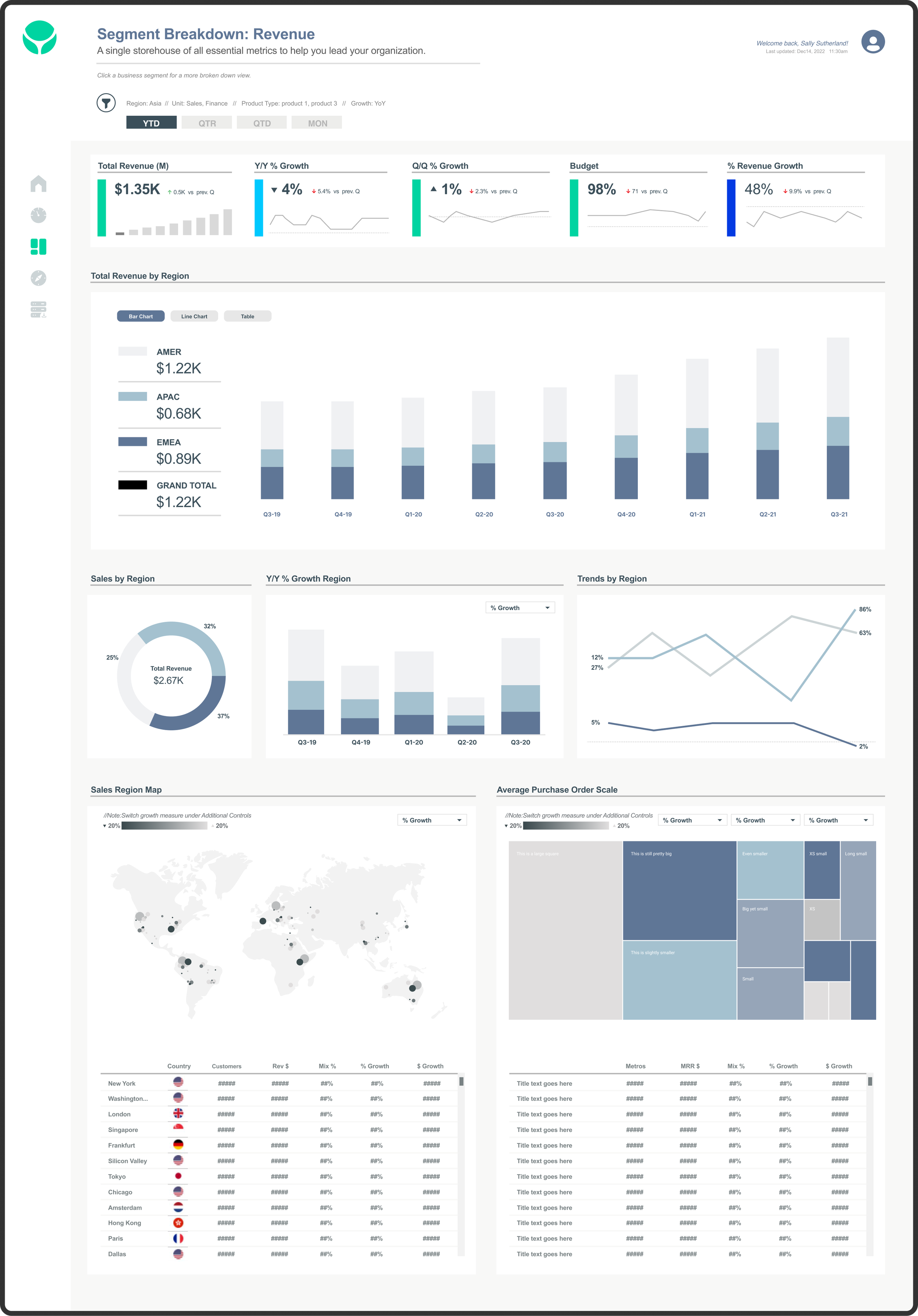
DataSphere Analytics
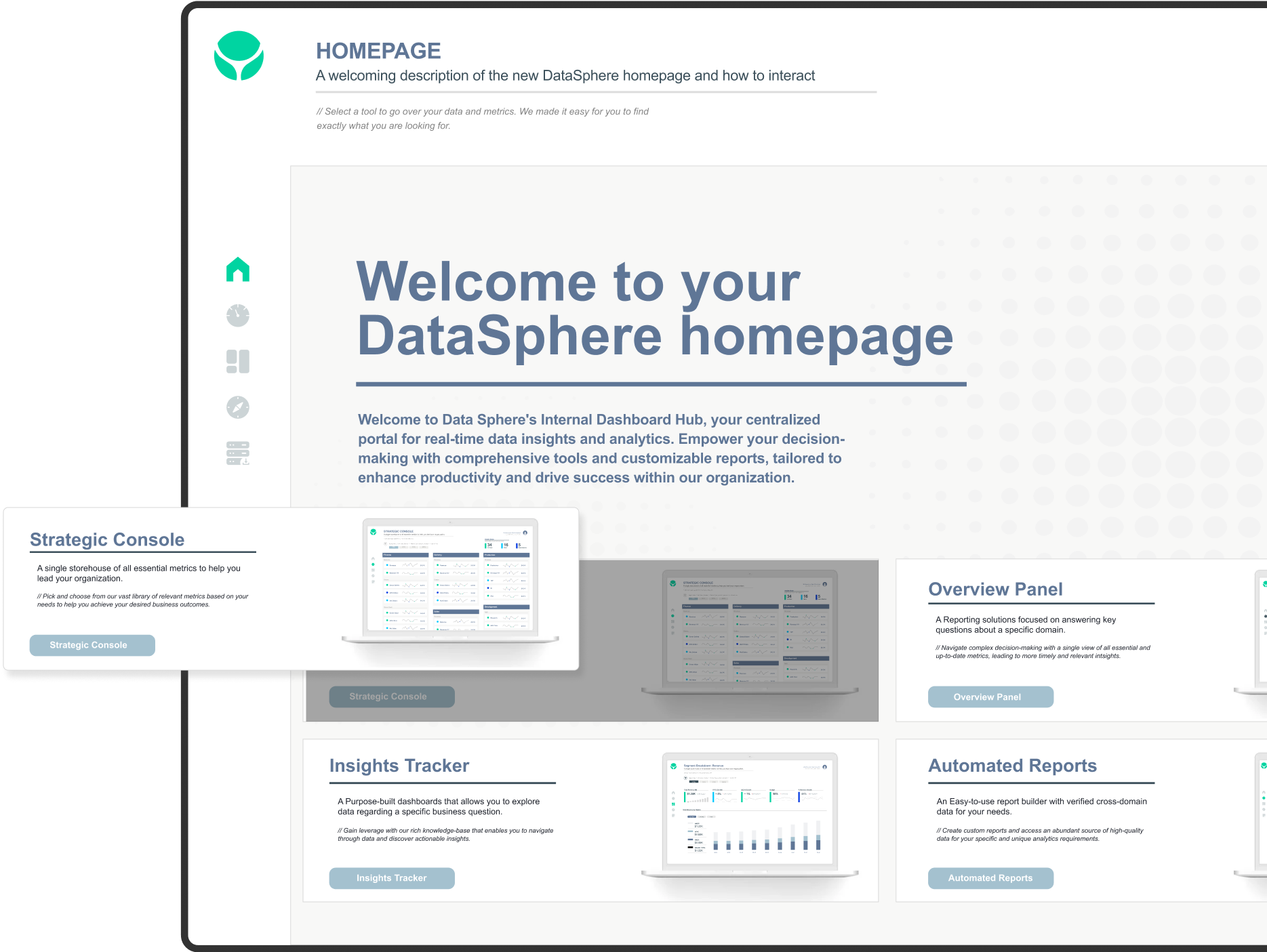
A executive cockpit to quickly guide users to meaningful insights.


SmileCraft Dental

Patients, revenue, procedures and more data to sift through.


FPS Staffing

Metrics on staff tasks and current sales.


Plop Data

A colorful conversation with data, and simple standards to follow.


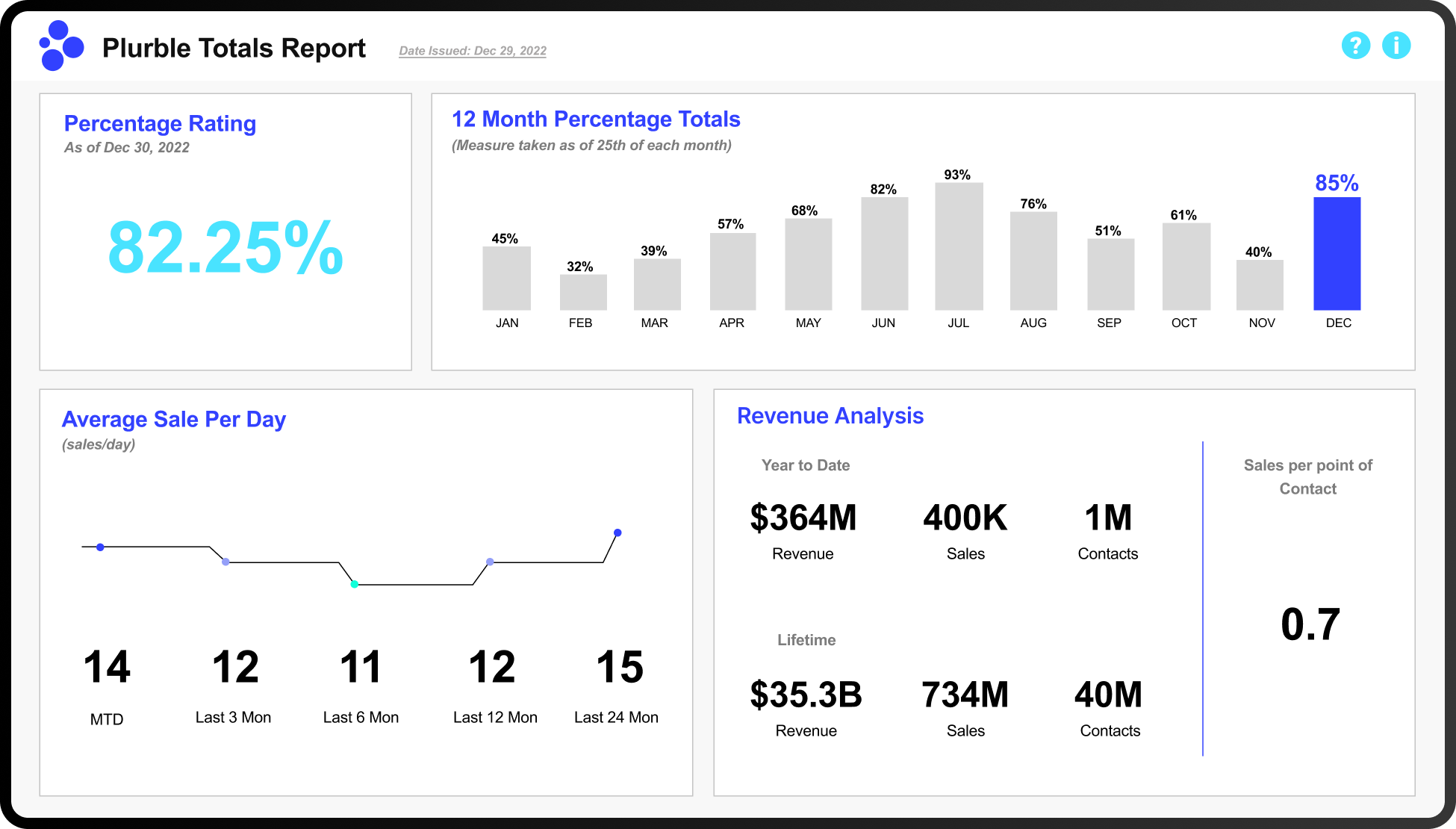
Plurble Analytics

Simple & clean bold KPI’s to lead data conversations.